CX VERSION 1.33
FEATURES
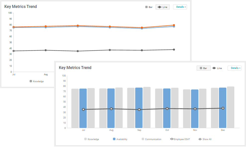
Some dashboard charts can be modified on the fly. The Key Metrics Trend chart can be converted to a line chart or a bar chart by selecting an option in the top right corner of the widget. Highlight one or more lines or bars in the chart by clicking the corresponding legend labels.
- This enhancement does not require configuration

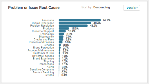
Any horizontal bar chart can be sorted ascending or descending using the Sort By feature in the top right corner of the widget.
- This enhancement does not require configuration.

Clients can add a logo to the CX application. The logo will appear in the CX header to the left of the project name. Logos must be…
- .svg or .png file type
- smaller than 6MB
- Max size of 1400px wide by 200px tall
- Compatible with a dark background.
- This enhancement requires configuration.

BUGS
This version includes fixes for several bugs reported in CX:
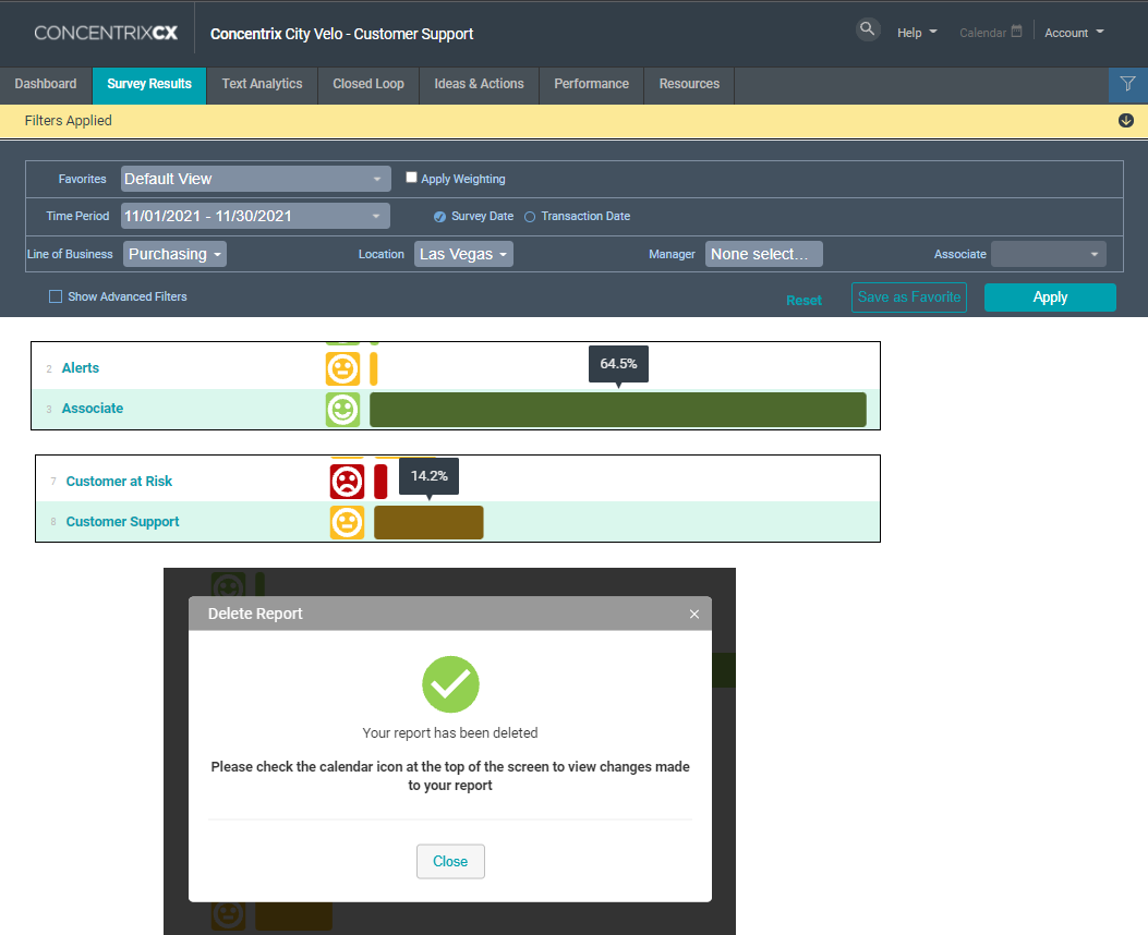
Filter Drawer: Fields in the filter drawer were shifting placement after selecting a field. This issue has been fixed and fields remain fixed in place at all times.
Filter Selections: There was an issue with CX dropping filter selections after the user navigates away from the dashboard and then returns to it. This issue has been corrected, and filter selections remain in place until the user clears them.
Text Mining Details: End users discovered an inconsistency in the number of decimal places displayed in the Text Mining Details view. Now, when the user hovers the cursor over any category, the value shown will always display the same number of decimal places.
Scheduled Reports: There was an issue with the format of the popup message displayed when the user deleted a scheduled report. The issue has been resolved, and the Delete Report popup message displays all text formatted
